Responsive Web Design Services for Every Screen
Give your customers a consistent, easy-to-use website experience across mobiles, tablets, laptops and desktops. We design responsive websites that adapt to different screen sizes while supporting usability, performance and your business goals.
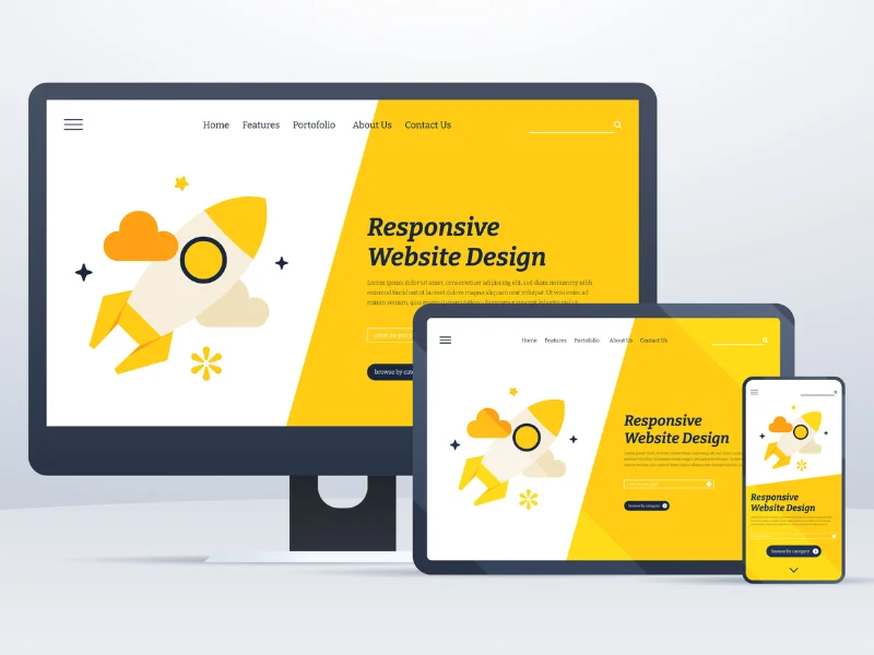
A Website That Works Wherever Your Customers Browse
People visit business websites from a wide range of devices, browsers and screen sizes. A layout that works well on a desktop may become difficult to navigate on a phone if text, images, menus and forms do not adapt properly.
Our responsive web design services focus on building flexible page layouts that adjust to the available screen space. We consider navigation, typography, images, buttons, forms and content hierarchy so visitors can find information and take action without unnecessary friction.
Whether you need a new business website or improvements to an existing WordPress website, we can help create a more consistent experience across devices.
Our Responsive Web Design Services
Responsive design involves more than shrinking a desktop layout. We adapt the structure, content and interactions to suit the way people use different devices.
Mobile-Friendly Website Design
We design layouts that make important information, navigation and calls to action easy to access on mobile screens. Content is arranged to support comfortable reading and straightforward interaction.
Tablet-Responsive Layouts
We adapt columns, menus, images and content spacing for tablet screen sizes, helping pages remain clear and usable between mobile and desktop layouts.
Desktop and Large-Screen Design
We make effective use of larger screens with balanced content widths, structured layouts, readable text and consistent spacing rather than stretching every element across the page.
Responsive Navigation
We plan menus, navigation controls and page pathways so visitors can move through your website on touchscreens and with a mouse or keyboard.
Flexible Images and Media
We help images, videos and visual elements fit their containers, preserve their intended proportions and avoid disrupting the page layout on smaller devices.
Responsive Forms and Calls to Action
We adapt enquiry forms, buttons and interactive components to make them easier to read, tap and complete across a range of screen sizes.
Responsive Design Built Around Your Website Content
A responsive website should preserve the purpose of each page while adapting its presentation to the visitor’s device. We look at how information is prioritised, how sections flow and which actions matter most.
- Flexible grids and containers: Page sections adapt to the available width without forcing users to scroll horizontally.
- Readable typography: Text sizes, line lengths and spacing support comfortable reading across screen sizes.
- Touch-friendly controls: Menus, links and buttons are designed for practical use on touch devices.
- Consistent visual hierarchy: Headings, images and calls to action remain organised as layouts change.
- Device-aware testing: We check representative viewport sizes and common interaction patterns before delivery.
Responsive Design, Usability and Website Performance
A useful website must be easy to navigate and efficient to load as well as visually adaptable. We consider the following areas during responsive design and implementation.
Performance-Conscious Design
We consider image dimensions, asset usage, page structure and layout choices that can affect loading experience. Actual performance depends on the site, hosting, content and implementation.
SEO-Friendly Structure
Responsive presentation works alongside clear headings, crawlable content, descriptive links and sound technical SEO. Responsive design alone does not guarantee search rankings.
Accessibility Considerations
We consider readable contrast, keyboard access, meaningful labels and usable controls. Accessibility requirements vary, so testing should reflect the needs of your website and audience.
Clear User Journeys
We help visitors reach important information, understand your services and complete actions such as submitting an enquiry without unnecessary steps.
Responsive Websites with a Strong Foundation for Search
A website should serve people first while making its content clear for search engines and other discovery systems. Responsive design is one part of a wider technical and content strategy.
Consistent core content
Keep important information available across device layouts rather than hiding essential content on mobile.
Logical heading structure
Organise page content into clear sections that are easier for people and search systems to understand.
Helpful internal navigation
Connect relevant service pages and supporting resources using descriptive, contextual links.
Mobile usability checks
Review text readability, interactive elements, layout stability and common viewport widths.
Structured, trustworthy information
Present accurate service details, business information and useful answers that support a good user experience.
Our Responsive Web Design Process
A structured process helps us address layout, content and usability needs before your website goes live.
Understand
We review your business goals, audience, existing website and the actions visitors need to complete.
Plan
We organise page sections, content hierarchy, navigation and responsive layout behaviour.
Build
We implement the design with flexible layouts, suitable breakpoints and responsive components.
Test and Refine
We review representative screen sizes, check key interactions and address layout issues before delivery.
Responsive Website Design for Different Industries
Every industry has different content, customer expectations and conversion goals. We adapt responsive layouts to the way your audience explores your business and services.
Service details, contact information and enquiry pathways.
Clear service descriptions, credentials and consultation requests.
Product browsing, readable details and usable shopping flows.
Structured service pages, product information and lead generation.
Accessible service information and convenient contact options.
Course details, programme information and registration pathways.
A Practical Approach to Responsive Website Design
Responsive design should support your business objectives, not just make a page fit on a phone. We focus on a maintainable layout, clear content and useful interactions that work together across devices.
For WordPress Websites, we also consider the existing theme, page structure and content management requirements. This helps us identify whether targeted improvements or a more extensive redesign is the better approach.
Responsive Web Design FAQs
Answers to common questions about responsive websites, mobile usability and implementation.
What is responsive web design?
Responsive web design is an approach to building websites that adapt their layout and content presentation to different screen sizes and devices. It commonly uses flexible grids, fluid images, CSS media queries and responsive components.
Why does my business website need responsive design?
Responsive design helps people browse your website on mobile phones, tablets, laptops and desktops. It can make information easier to read, navigation easier to use and enquiry actions more convenient across devices.
Is responsive web design important for SEO?
Yes, responsive design supports a mobile-friendly experience and is aligned with Google’s mobile-first indexing approach. Rankings still depend on many factors, including content quality, technical accessibility, relevance, page experience and competition.
Can you make an existing WordPress website responsive?
In many cases, yes. We can review the existing theme, page layouts, plugins and custom styles to identify responsive issues. The required work may range from targeted CSS adjustments to redesigning specific page templates or sections.
Will my website look exactly the same on every device?
Not necessarily. A responsive website aims to provide a consistent brand and user experience, but its layout may change to suit each screen. For example, columns may stack on mobile and navigation may use a compact menu.
Does responsive design make a website faster?
Not automatically. Responsive design can be combined with appropriately sized images, efficient assets and performance improvements, but speed depends on many factors such as hosting, scripts, plugins, caching and page content.
Can you create a responsive e-commerce website?
Yes. Responsive e-commerce design can cover product listings, product details, navigation, cart interactions and checkout layouts. The implementation depends on the platform, store configuration and specific business requirements.
How do you test a responsive website?
Testing typically includes reviewing representative viewport widths, checking navigation and forms, inspecting images and text, testing keyboard and touch interactions, and using browser developer tools and real devices where available.
How much do responsive web design services cost?
The cost depends on the number of pages, complexity of the layouts, current website condition, platform, required functionality and extent of testing. Contact us with your requirements for a more relevant estimate.
Can you improve mobile usability without rebuilding the entire website?
Often, yes. If the existing site has a suitable foundation, focused improvements to spacing, typography, navigation, images and forms may be enough. We assess the current website before recommending the scope of work.
Make Your Website Easier to Use on Every Screen
Tell us about your website, audience and goals. We can help identify the responsive design improvements that make sense for your business.
Talk to Our TeamDiscuss Your Responsive Web Design Project
Share a few details about your current website or new project. We can discuss your requirements, the devices your customers use and the next steps for improving your website experience.
New responsive website design
Existing website improvements
WordPress responsive layouts
Tell Us About Your Project
Complete the contact form and our team can review your requirements.